Historic Preservation & Building Reuse
Reusing, refurbishing and reinvesting in our historic building, as well as the infrastructure that feeds into it—such as existing roads, sidewalks, utilities, transit, and local services—is the most significant greening strategy undertaken at the Guardian. This is due to reusing its embodied energy, the total energy required for the extraction, processing, manufacture and delivery of building materials to a building site. When we reuse buildings on previously developed urban sites, we avoid demolition and landfill as well as extracting, manufacturing and transporting new materials. It’s recycling on a massive scale while retaining historic integrity and context for future generations.
A Well-Articulated Example of Nineteenth Century Romanesque Architecture
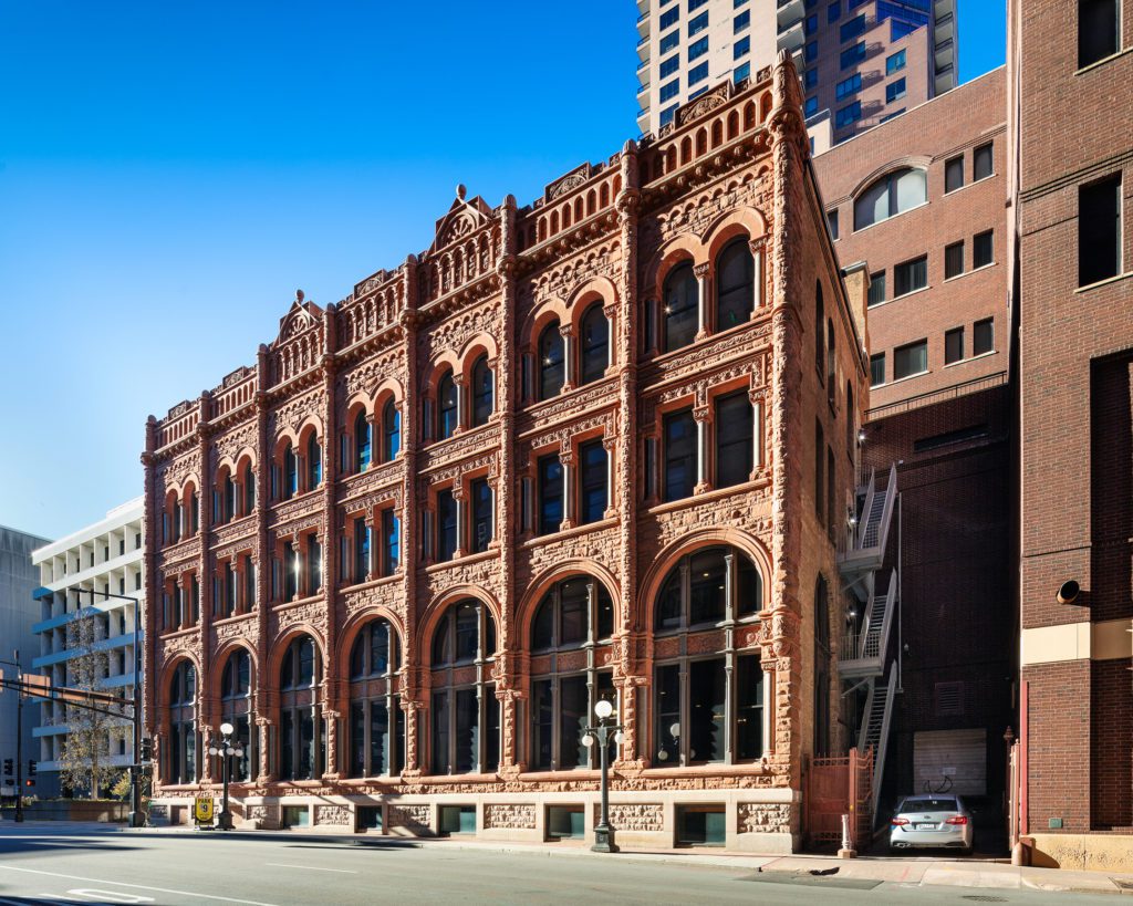
Commissioned by James J. Hill, a late 19th C. railroad baron, the Merchant’s National Bank (now known as the Guardian) was designed by Architect Edward P. Bassford and erected in 1892 in the Romanesque style. The Merchant’s National Bank is a four-story combination stone bearing wall and steel frame commercial structure. The first floor was designed as a banking facility. Office space was available on the top three floors, accessible from the staircase leading up from the first-floor lobby.
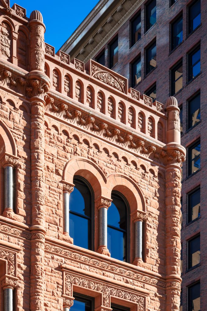
Architecturally, the building is a well-articulated example of Romanesque design. The front (west) and side (south) elevation, which are the only two elevations with any architectural detailing, are well organized complementation of glass and stone masonry surfaces. Each bank of windows is divided by a turret extending above the roof line. The windows are of arched design at the bottom and top levels, with the bottom windows designed in such a manner as to make the first two floors appear as one. The overall effect is to create the appearance of an extremely well-proportioned three-story building.
The most distinctive feature of the exterior is its ornate appearance characterized by the careful utilization of rough, carved and polished stone. Built on a granite base, local rusticated red sandstone faces the exterior, with polished stone columns and carved stone lintels detailing the window openings. Carved stone is also utilized along the upper cornice line. Consequently, the overall result is an extremely attractive and highly textured exterior facade.
Preservation & Reuse
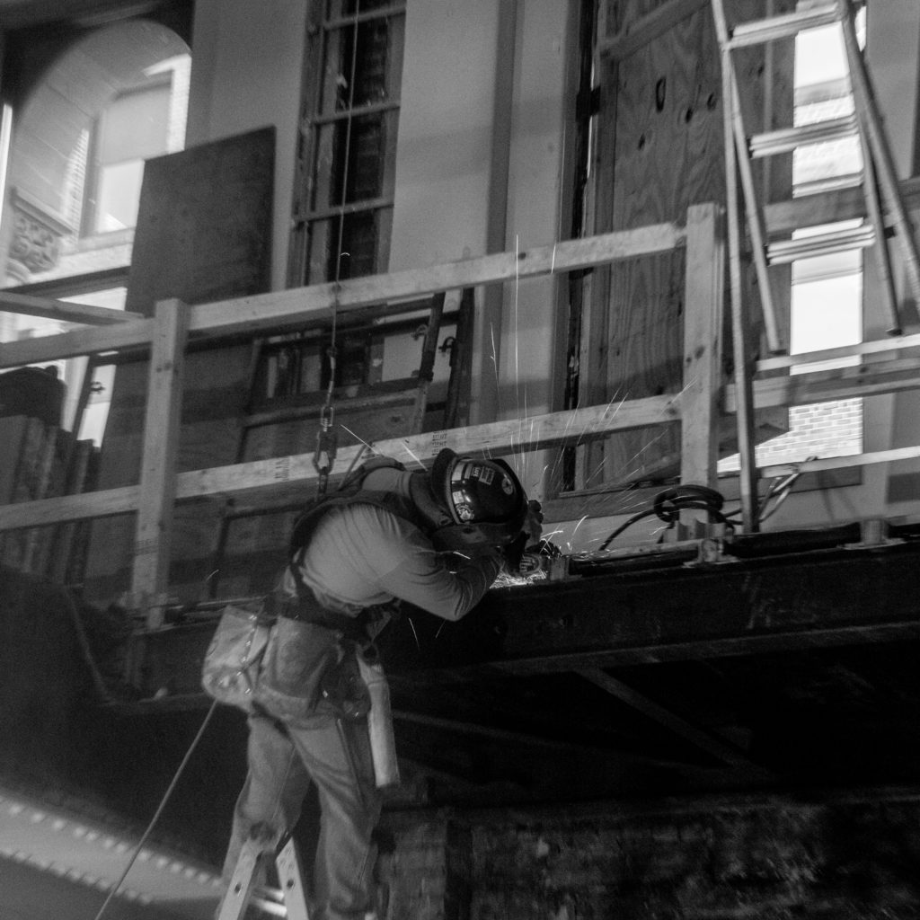
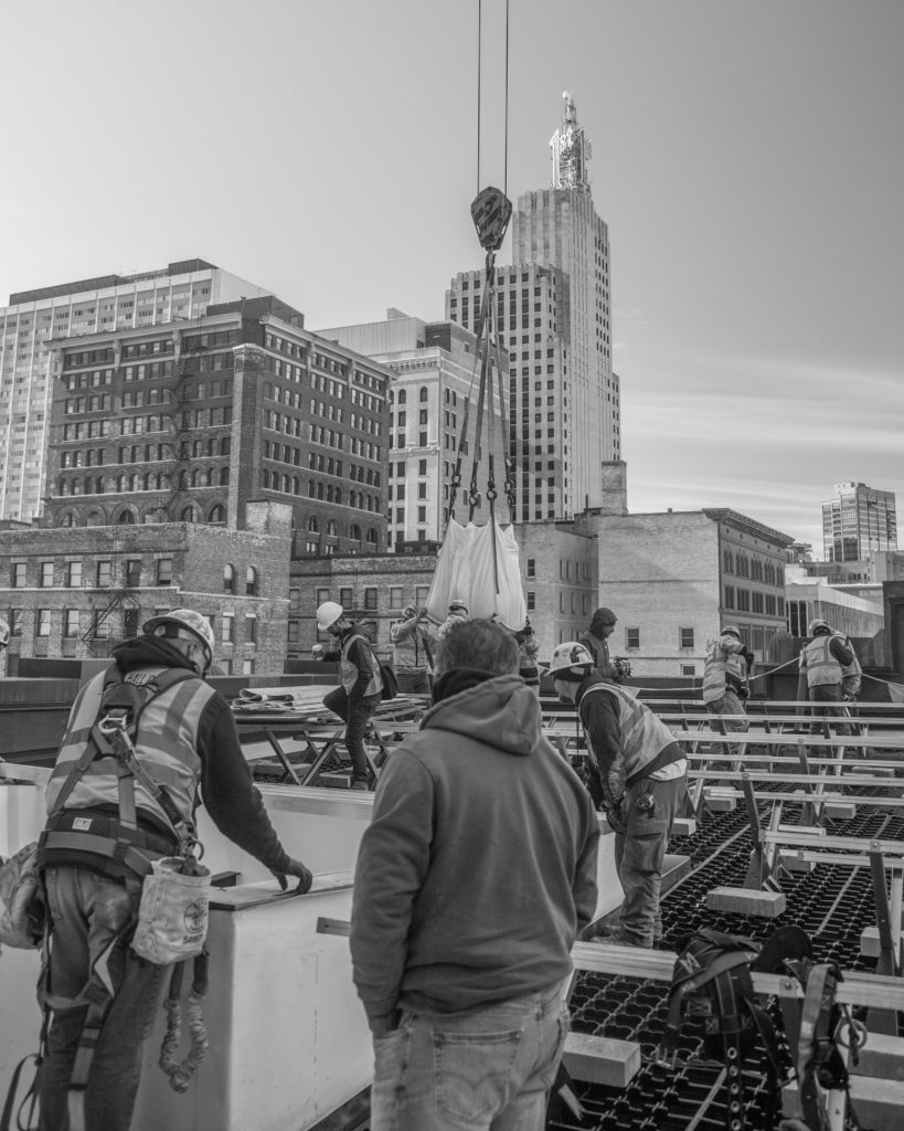
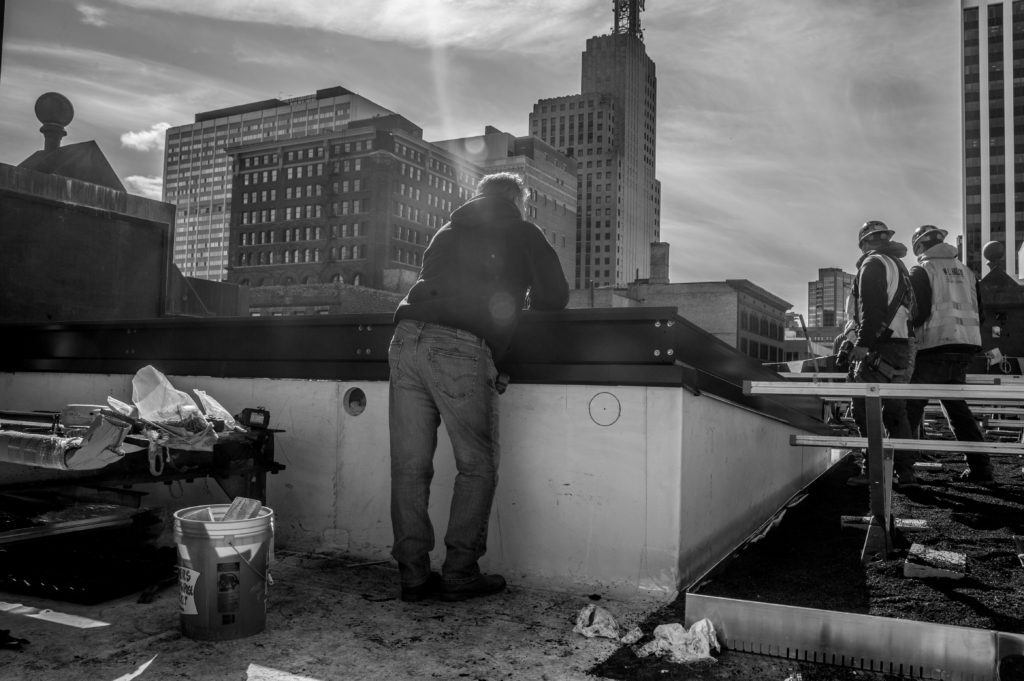
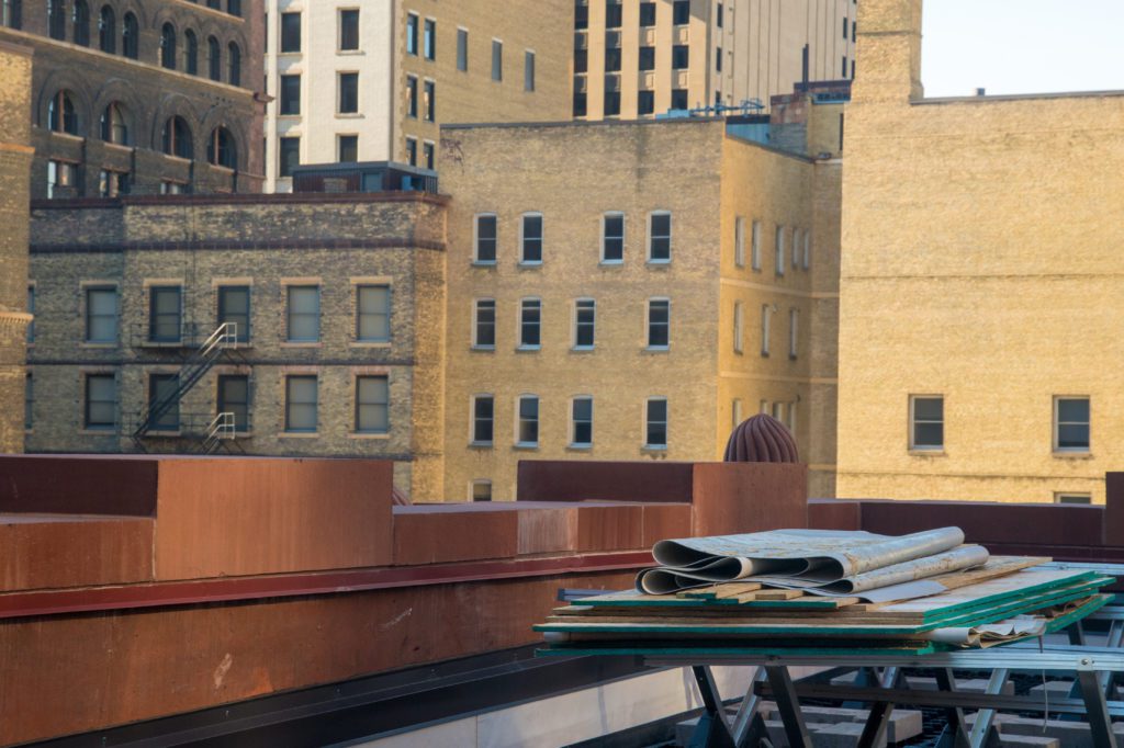
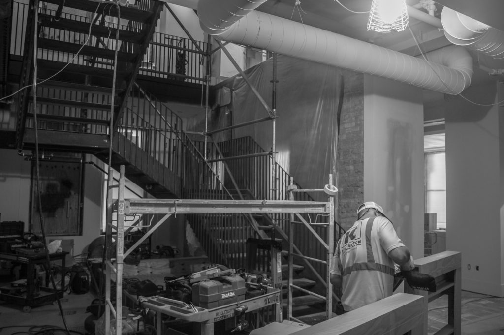
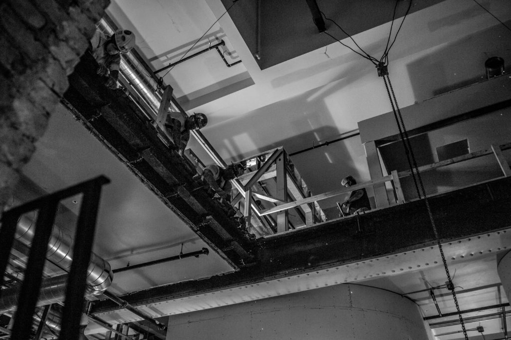
The project focused on two areas of work. The first was the full restoration of the missing original parapet back to the impressive original design and configuration. The original stone was no longer available so a carefully-selected cast stone was utilized. The second area of work was the complete remodel of the 3rd and 4th floors into a modern workplace. The rehabilitated space was conceived as a light-filled meeting place for those working tirelessly to defend their clients.
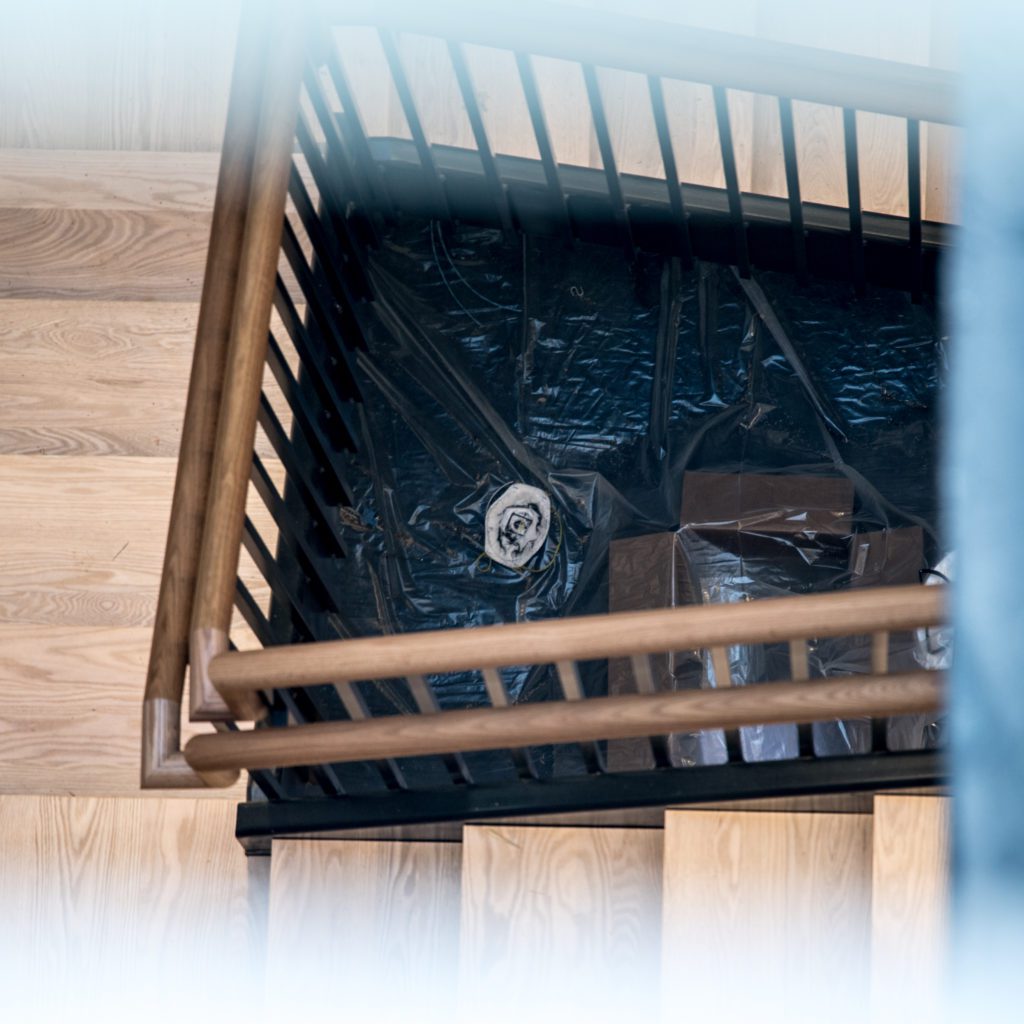
A large opening was cut through the roof assembly down to the third floor. This vertical shaft is a beacon for light and movement. The surrounding historic layers are left exposed to provide a visual narrative of the historic structure. Original maple flooring was found intact under several layers of just about every flooring imaginable and restored to its original finish.
